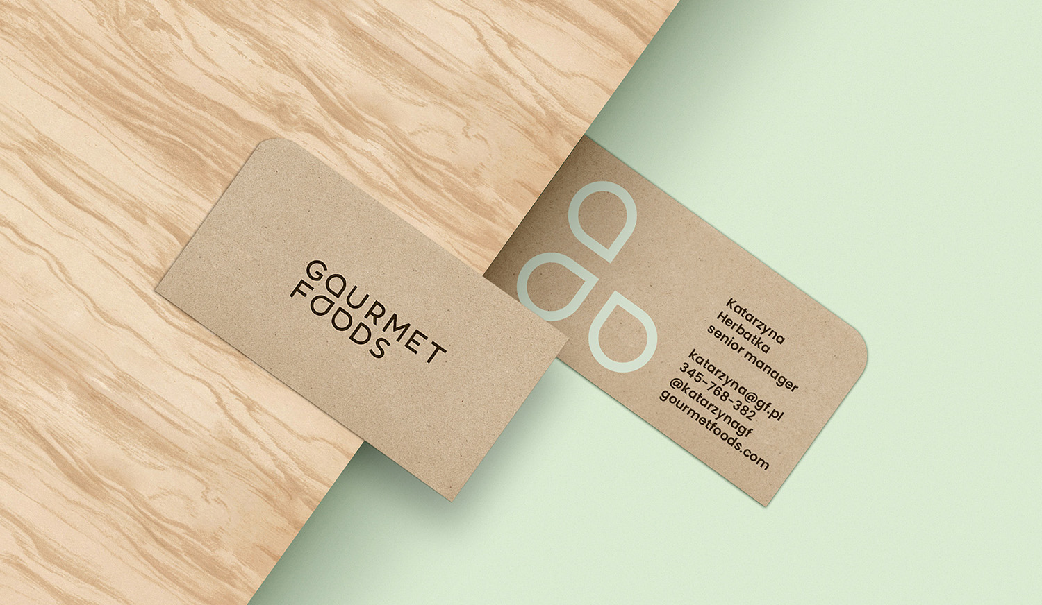
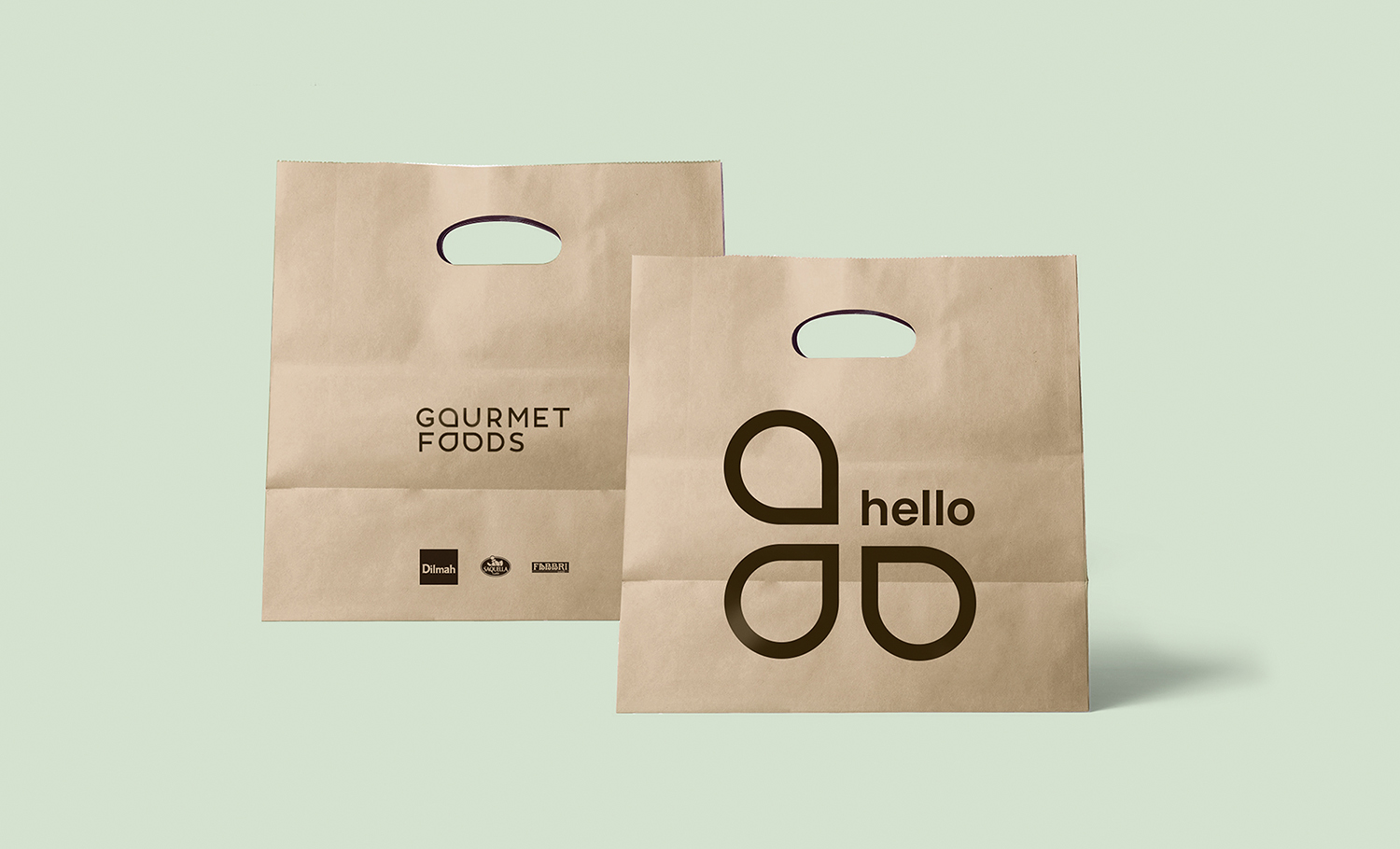
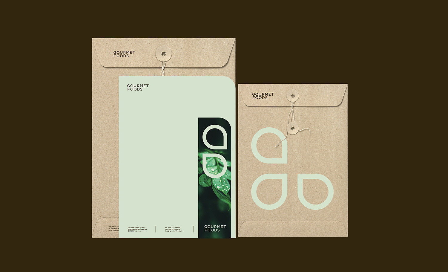
Redesign logotype and new branding for Gourmet Foods.

Gourmet Foods is a distributor of premium brands in the hot drinks category operating since 1989.
He approaches business with respect and understanding of the needs of clients,
and all partners offer relationships based on dialogue resulting from experience in the category.
As part of the project, I designed a new branding based on a new redesign logotype.
The simple and clear idea inscribed in the logotype contains a drop - a symbol of purity,
health and charity of nature. Drops in the Gourmet Foods logotype is also a metaphor
for quality and the principles which brands follow in business relations.
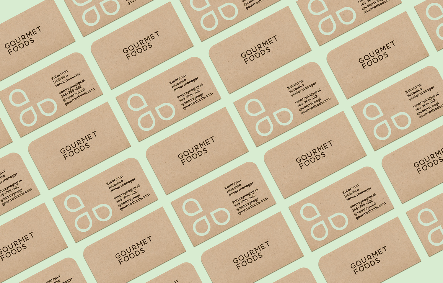
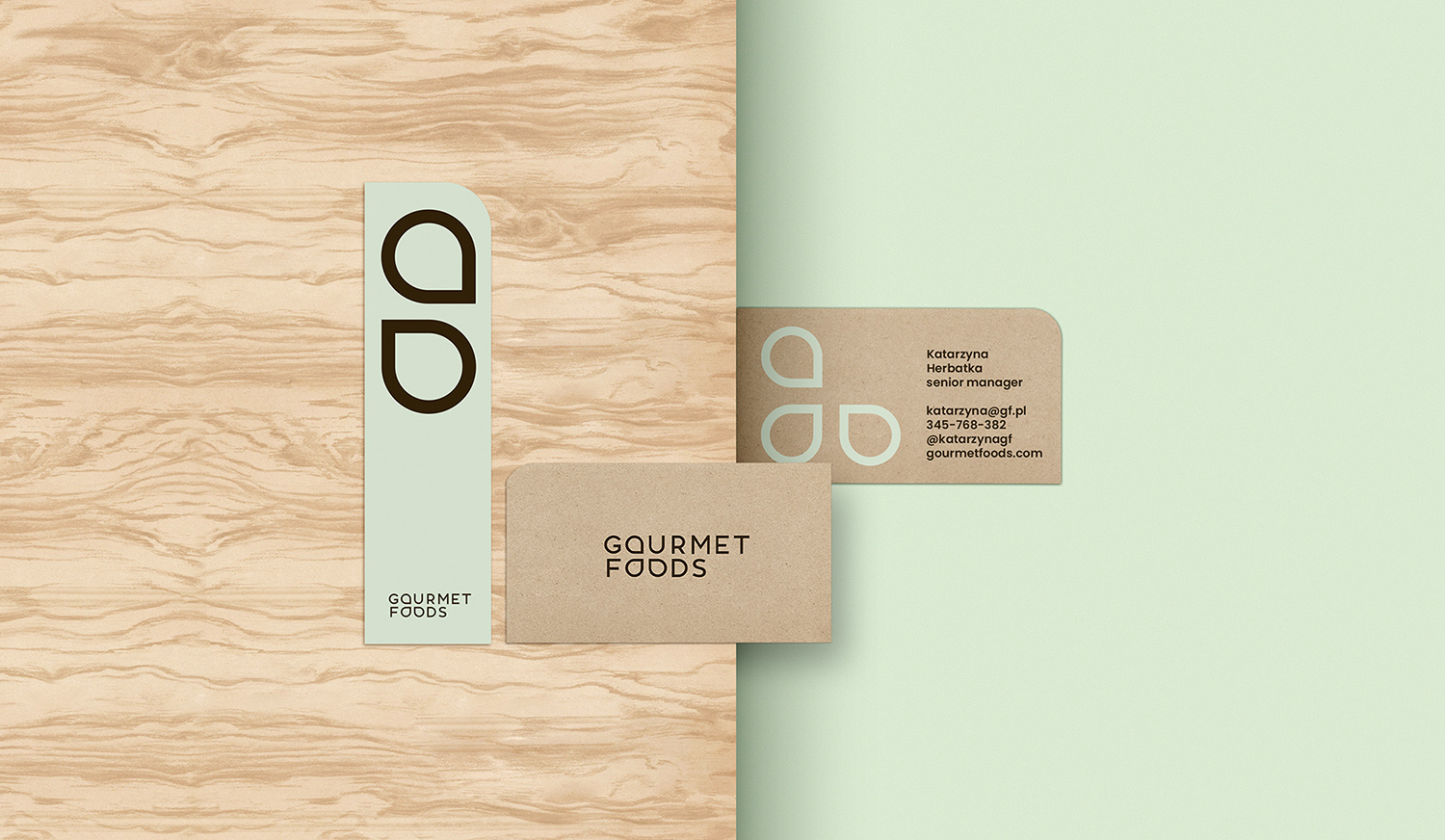
Natural colors, ecological papers, simple typography and systems for the elements are the clu of branding.

studio: Walk with David / design&concept: ale.lampart / render 3D: Albert Bonarski

